‘’Milou Ket gives insight into her new Interiors book, edition 2018/2019.”
Introduction
In her new book for 2018/2019 Milou Ket shows the most influential international themes. The book contains both summer and winter themes. There are six themes featured, all with their corresponding color cards. For weavers, printers and spinners there is a special box with colors, meant for the interior, contract and hospitality market, where cotton yarns are dyed after specification. Besides that, there is a list of the compatible Pantone® cotton colors. Every theme is shown with its corresponding color card, plus more than 200 inspiring materials that match the themes in color and character.
Also this year color has been the starting point to compose the book.
In this time of transformation, the interest to explore sustainability and innovation will continue. Designers are researching our resources and experiment with natural materials, such as algae en funghi, minerals and discover long forgotten procedures. And try to find alternative materials.
In general the interior has become more colorful. White is important, but we see also a few very light pastel colors. They can be combined with the range of bright pastel colors, and even with an accent of the bright colors. In multicolor combinations then also a darker color is added for more definition. But now also darker, moody colors are accepted, mainly in shades of blue and blue green. Our interior shows traces of wear and use. Textures, aged and worn aspects give a sense of warmth and familiarity to the interior.
The first theme, with white and very light neutral colors and some refined cool pastel colors, is called “Where Serenity Reigns”, to create a peaceful environment. The second theme, “Acid Transformation”, is influenced by fresh, bright pastel colors, inspired by candy for geometric or more organic design. The third theme, called “Around the World” is based on the mix of influences from all over the world. Deep, warm colors prevail, but also the materials are rich, such as velvets. In the fourth theme “High Voltage” primary and bright colors prevail and are the base of a more colorful interpretation. Here black and white are added for more definition. In the theme “Nature’s Calling” we see the influence from nature in shades of green, but also in blue water shades, combining old and new, sometimes combined with an industrial setting. In the theme “Eclectic Luxury” we see luxurious, as well as eclectic influences combined with historical ideas, for a direction with a dark base in combination with more brilliant colors.
Inspiration
The first theme is called “Where Serenity Reigns”. It is a theme with a quiet, cosy atmosphere, our own safe heaven where we can relax, and distract ourselves from the noisy world, truly our home. We are looking for consolation and security, and especially here we see an interest in textiles. Nature plays an important role. Materials are very important, because they are strongly linked to effects of textures. Warm felt, heavy textured knits, fur, suede, wood and leather, are opposed to smooth materials. Especially materials with a pile give character to products, such as velvets and the interest in rugs and carpets. The materials are often lightweight, but bulky. They often show a protective effect, are soft, airy and padded. There are interesting products with acoustic properties, such as felt tiles in interesting shapes. The shapes of furniture is soft and rounded. We will see more color in our interiors, in cool pastel colors. Often unexpected or accidental oxydation, the effect of time and weather determines the appearance of products, marbling, stone and natural effects.
Colors
Besides some neutral colors, we will see more color in the interior. Especially soft pink will be important. Often we see that different shades and intensities are combined for an interesting effects. As colors we see: Greyish Blue, Greyish Green, Greyish Lilac, Cream Pink, White, Yellow Beige, Light Taupe and Light Camel. The combination of black and white will continue, but not as strong as before and will be applied in finer effects. Color ranges can be combined, but this range is the base.
Inspiration
This direction is called “Acid Transformation” as the colors are almost as acid like sweet candy. Gradients and watercolor effects are important ways of decorating products. We also see aquarelle prints, spots and stains. In this theme we see more synthetic influences, inspired by the 50-ties and -70-ties with rubber, silicone, plastic, dichroic and colored glass and porcelain. Transparency combined with opaque, and iridescence are important in rounded “blob” shapes, but also in facetted design with hard edges. Colors can overlap each other to obtain interesting shades. Also here accidental ways of decorating are important, aging or shifting of materials. We see often very airy shapes in this styling direction, with furniture made out of metal wire, for an airy effect. Furniture is often upholstered by airy, padded materials. The candy colors only add to that special effect. A special, popular category are the printed flower designs, for bedding, pillows, sometimes out of scale. Handwritten text adds a certain casual touch to prints.
Colors
The pastel colors for this styling direction are fresh and cheerful, reminiscent of fruits and candy and much stronger than we have seen before. Especially pinks are striking. As colors we see Pastel Lemon, Pastel Lime, Light Lipstick, Pastel Lilac, Lipstick Pink, Pastel Pink, Pastel Blues and Pastel Turquoise. These colors are added as accents to the previous range, or may be combined with darker shades for more effect. Colors can be almost layered, from very light to medium, strong or dark.
Inspiration
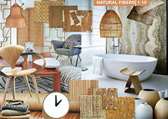
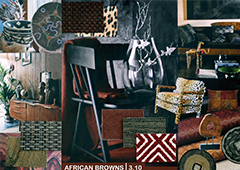
In almost all large cities in the world, people from different ethnic backgrounds live together, and leave a mark by sharing their different backgrounds while cooking or making music. They influence each other. We also travel a lot, and bring home memories from our travels. In this way we see a renewed interest and appreciation in hand-made products, and old crafts that are revived, or combined with modern techniques. Also the different shades of wood are important. Organic products such as leather and suede, wood, fringes, irregularities, old techniques such as shibori, wood work, marbling, raffia, etc. are popular again. Natural fibers are popular, such as bamboo, pineapple fiber, sea grass etc. Sometimes we see an unconventional combining of different weaves and prints, of with animal prints, inspired by African people, by Aboriginals or influences from the Far East, especially Japan and China. Indigo dyes, shibori techniques and other old crafts regain popularity again. Chalk paint is used to paint the house in an uneven way.
Colors
For this direction the colors are warm and rich and remind us of earth colors, of clay and pottery, or the autumn. As colors we see Amber, Light Terra Cotta, Faded Beige, Bleached Blue, Clay Brown, Warm Red, Peacock and Reddish Brown. These colors can be combined as well with the range of bright colors. Sometimes a pink color is added, or we see a kind of tomato red. Brown is an important background color, light beige will be used to highlight a product and may not be missed.
Inspiration
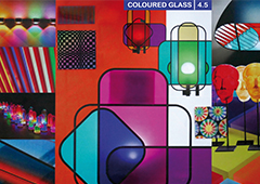
Modern art is an important source of inspiration for this style direction, called “High Voltage”. Especially the Memphis movement is an influence. Strong and bold contrast, with the addition of black and white plays a role. Mostly we see facets, geometry and graphical ideas. We see an interest in colored glass products, often with overlapping color, reminiscent of stained glass windows. Also mirrors are used to paint on. Popular products are executed in various rainbow colors and are offered as modules, for instance chairs, but also seating elements and bookcase elements. Besides that, these bright colors are used for outdoor products to evoke a sunny, summery atmosphere. There is also interest in cheerful African products. In prints designers make use of accidental effects, with spots and stains and bright color splashes. This direction is important for accessories, rugs and carpets, ceramics and glass, but now also for bold color statements of painted walls.
Colors
Color, mainly primary and bright colors are the base of this color range, often used as variation of the same product. As colors we see Acid Yellow, Bright Orange, Candy Pink, Bright Red, Turquoise, Bright Green, Cobalt Blue and Purple. They can be applied in strong contrast or tone in tone. In the interior they are also important as paint colors, for a single wall. Black and white are often added for more definition, and to bring the necessary contrast. Also these colors are combined with darker colors, and are used as well in combination with light and brighter pastels.
Inspiration
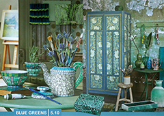
In this style direction, called “Nature’s Calling”, we see how natural elements, with lots of greens, are combined with industrial elements, old and faded, worn and aged. Old and new are combined. Flora and fauna and botanical ideas play an important role, but we see a shift towards more exotic elements. There is interest in prints for the colonial history of exotic places with palm trees and ideas derived from old engravings. Whole landscapes are depicted. Digital techniques make it possible to imitate all these effects. We see that especially in large digitally printed wall murals. Materials take a major role, are often imitated and should show traces of use. Piles, textures, relief, and high/low effects are important, think of suede, velvets and acoustic materials, such as felt. Also in carpets, digital techniques and laser cutting are quite new. Designers continue to be fascinated by experiments with materials and natural elements, such as oxidation, the weather, the tide, seas and clouds. And make use of accidental designs.
Colors
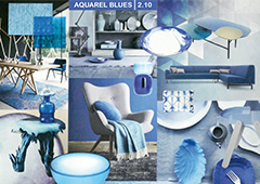
These shades of green and blues evoke a soft natural organic atmosphere, reminiscent of the greens from nature and the blues from water. As colors we see Greenish Yellow, Soft Green, Light Olive, Blueish Green, Greenish Blue, Golden Green, Olive Green and Bronze Green, a kind of Khaki. Because textures are so important, the result is very lively, with highlights and shadows. It is possible to combine these colors with the blues and greens of our other style directions for an interesting effect, either pastels or bright accents.
Inspiration
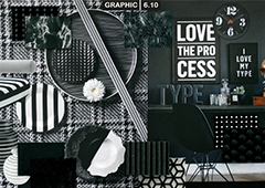
In this direction we see historical influences, inspired by “The Golden Age”, visible in realistic painted flowers on a dark ground and in historic portraits. These portraits are often traditional ones of about for instance animals, but with a humorous twist. Also we see images of the universe and galaxies. We see products made of metallics, sometimes oxidized, such as gold, copper, bronze, brass and silver. The colors in this style direction are dark and moody, but are combined with a few brighter accents, like stars in the night. When there are combinations with metallics we also see an interest coming up for Art Deco influences from the 1920-ies. Graphic black and white will be continued. We will see graphic interpretations with letters and quotes, or other applications such as spots and stains, hazy images of landscapes. Also fine defused lines. Sometimes nature can be a source of inspirations such as the tide, the weather, the moon, rocks and marbled surfaces.
Colors
Here dark and moody colors prevail: they are the background for more brilliant colors that shine like stars in the night. As colors we see: Deep Cyan, Deep Blue, Deep Peacock, Navy Blue, Deep Fuchsia, Warm Brown, Dark Grey and Black. Often the blues are used tone-in tone, blues and greens are combined for an interesting effect. Also Purple, from our High Voltage range can be added, especially in combination with Deep Fuchsia. Also Warm Red, from our theme “Around the World” would fit into this range of dark colors to evoke a nice rich effect.

