Now that we have been “locked-up” for a considerable time because of the pandemic, we value our homes even more than before. Special interest is going to develop products with a nice, comforting touch, often inspired by nature. Also to the home office, or a place where you can shut yourself off from distraction, think of acoustic products, and sometimes even a place where one can exercise. In general nature will play a more prominent role, in almost all themes. There is more attention for sustainable materials, but also more sustainable production methods. The shapes are round and friendly, we will see more circles and arch shapes. Moody, deep dramatic and opulent colors are accepted.
- Longing for Serenity
Inspiration:
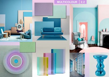
The first theme is called “Longing for Serenity”. We are trying to find peace, calm and serenity in our homes by the use of soothing, quiet colours. The interior is characterized by airiness, transparency, clearness and lightness. The home is a space for contemplation and meditation, to unwind from the stimuli of the outer world. People are looking for purpose and meaning.
Natural materials with a lot of textures play an important role. Rounded shapes, circles, ovals and classic arches are important shapes. Consciously consuming will play a role. Ideas are inspired by processes in nature such as the tide, the wind, bacteria etc. Consumers will require more and more environmental conscious materials. Plant based colours, materials like algae, hemp, corn, linen, bamboo and bioplastics etc. will be in demand. Natural materials such as wood, rattan, linen, leather, bone, stone, ceramics are popular. Hard and soft are combined. We see hand knitted coarse textures to oppose smooth surfaces. Textiles, such as carpets are important to give warmth to the interior, but also products with acoustic properties such as felt.
Colors:
The colors of this theme are quiet and dusty, for a calming effect. Especially a dusty pink is important. As colors we see Light Taupe, Dusty Light Blue, Dusty Pink, Off-White, Soft Yellow, Kit, Beige and Light Brown. Sometimes a small outline in black or anthracite is applied.
2.Indulge in Pastels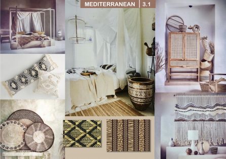
Inspiration:
The second theme is called “Indulge in Pastels” and shows fresh clear pastel colours for a modern, contemporary direction. Colour planes and abstract design are important. Translucent materials such as glass and resin etc. are treated often with gradients of colour. Colour is not only applied on glass, but also on coloured silver glass, and mirrors and products such as lighting, furniture and for instance room dividers. One plays with the overlapping shapes of these transparent colour planes. Pastels are applied on wallcoverings often in abstract geometric patterns, but also in textiles and especially new applications such as carpets or textile wall hangings. The shapes are simple, and often rounded and friendly. But besides rounded shapes, we will see also more sharp shapes, such as facets. And we’ll see asymmetric and streamlined shapes. There is a lot of small furniture, such as stools and other modular pieces to meet the need for versatility and change. In the interior there are arches and circles. There is also a lighter, friendly approach possible, almost romantic without becoming too sweet, with flower patterns, and motifs like for instance of birds. Sometimes these patterns are applied in patchwork.
Colors:
In this range we see fresh pastel colors, but they are harmonious and not too aggressive. They combine well together. The colors in this color cards are: Coral, Orchid Pink, Soft Pink, Fresh Green, Yellow, Light Blue, Lilac, Mint. These pastels can be combined with the bright colours as well, but the most fashionable approach is the combination with terra shades. Often dark colours are applied in smaller touches. Black or anthracite outlines are used.
- Celebrate Diversity
Inspiration:
This styling direction is influenced by the cultural expressions of various people from all over the world. Because we are travelling and take home souvenirs, but also because many people from different ethnic backgrounds are living in the large cities. And of course because of internet that brings the world closer. Especially Africa will be in the centre of interest. All kinds of handmade traditional products and crafts are appreciated.
One approach is a Mediterranean style, with neutral colours, such as off-white in combination with brown or black. Especially handmade baskets are important. Traditional textile techniques are valued, such as shibori, tie and dye, Japanese sashiko embroideries and ikat, but there is also interest in cyaonotypes en recycled textiles. Natural materials such as wood, rattan, raffia, reeds, rope and bamboo are applied together with decor with shells, animal prints, kilims and African wax prints. Young designers try to combine these traditional handicrafts with modern techniques, for example with laser cutting or digital printing. Colourful pillows and throws with traditional patterns are easy to combine in Bohemian interiors. Artists and designers are making nice, surprising masks of recycled plastics and of ceramics. Indigo blue patterns remain popular.
Colors:
The colours in this ethnic direction are warm. Often brown is used as a base colour. Off white is used as a neutral light colour to combine with this range. Sometimes bright colours are used as an accent. The colours of this colour card are: Dark Teal, Mustard Yellow, Warm Orange, Burned Sienna, Brick, Warm Red, Warm Brown and Indigo Blue.
- Activate Brights
Inspiration:
This style direction is based on the influences of Modern Art, especially of Bauhaus, Constructivism, the Dutch style direction “de Stijl” and Memphis. Also Sonia Delaunay is a good example of geometric abstraction that is so important for this style direction. These bright colors are used for color planes, and color blocking, for facets, and abstract shapes, for textiles and carpets. Glass and translucent materials such as resin play an important role, with overlapping color planes, and mirror effects. These ideas are applied for sliding doors, lighting and accessories. These bright colors are mainly used for objects such as a single chair, and colorful accessories. Think of stools, vases, colorful carpets, side tables, and bottles. Black and white, also in striped patterns, are used as outlines to make the colors pop.
There is also a second color card with softer bright colors, reminiscent of paintbox colors. that are used for botanical ideas. They lend themselves to designs with stylized flower patterns and birds. They are also used for modular furniture, steel thread furniture, and decorative carpets.
Colors:
Primary colors are combined with some nice bright colors for the first color card. These colors should be combined with black and white. The colors are: Bright Blue, Bright Yellow, Bright Red, Bright Green, Bright Orange, Turquoise, Hot Pink and Purple. A second color card shows somewhat softer, more fashionable colors. The colors are: Lemon Yellow, Bright Coral, Bright Pink, Lipstick Red, Bright Yellow Green, Light Teal, Mid Blue, Ultra Violet.
- Care for Mother Earth
Inspiration:
This theme “Care for Mother Earth” is based on our previous theme “Embrace Sustainability”, because sustainability has become one of the greatest challenges for the future. Durability and sustainability are key issues. Designers and brands are looking for alternative materials and packaging, such as plant-based colors, algae and bacteria.
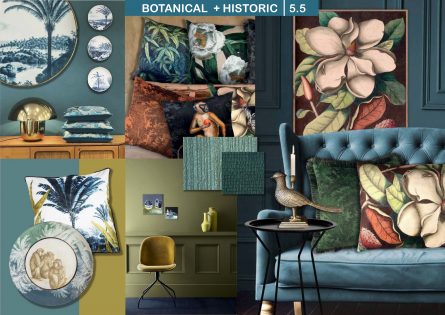
We idealize nature and want to connect with it. We do so by surrounding ourselves with natural materials, such as wood, leather, linen, rattan, bamboo, reeds, alabaster. Sometimes this style direction is mixed with industrial elements, and material imitations that remind us of affected wood, corrosion, speckled, crumpled and marbled surfaces. Textures are important. Natural History books are in the center of interest, and we love prints that are based on old engravings, of plantations and foreign countries, of exotic animals such as leopards, jaguars and monkeys. Sometimes even extinct animals are depicted. Also exotic birds, parrots, botanical prints of passion fruit, orchids and figs, are shown. Insects are present, made of ceramics, or even paper. Foliage and jungle prints are not new, but people do not seem to get enough of it.
Colours:
In this styling direction we see subdued colors of stone and clay, but also the continuation of some important green shades. However, depending of the subject, sometimes some bright colors are added for a special effect, for instance in jungle prints. The colors in this range are: Brown, Dark Terra Cotta, Light Terra Cotta, Dark Mustard, Light Green, Light Olive Green, Olive Green and Dark Moss Green.
- Rethink Heritage
Inspiration:
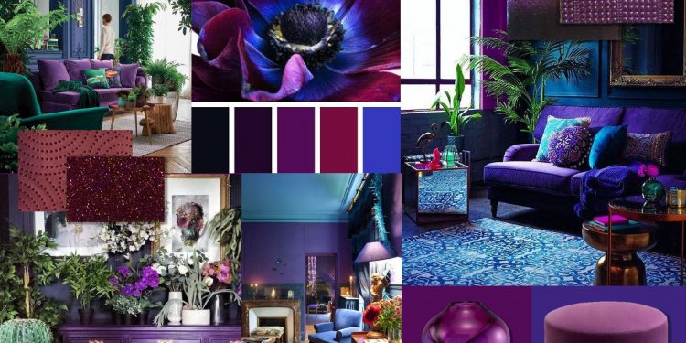
In this direction “Rethink Heritage” dark moody colors with a glamorous effect are accepted, especially for wallcoverings and paint. There are several influences but mainly from historical sources, our heritage, that are translated to our current taste, but with a twist.
One of these sources is the curiosity cabinet, where rare specimen of natural history are exhibited. Animals are depicted as humans in decorative applications such as trays and paintings. The old painters from the Dutch Golden Age with their detailed paintings of flowers and still lives are an example for decoration as well, for ceramics, murals and wallcoverings. Also engravings are an inspiration, as we can see in the products by Fornasetti. Metallics remain important for this desired glamorous effect, such as gold, bronze and now the new colored silver glass. Iridescence serves the same goal, of glamour and is applied for glass, ceramics, and metal. Luxurious materials are important, think of natural stone and marble. And for textiles silk, satin and velvets. Art Deco influences are visible in the application of thin metallic lines. Brown is becoming more important in the interior and is often combined with grey. Ochre and gold are added for warmth.
Colors:
The colors in this range are dark and glamorous. A few dark colours such as night blue, brown, grey and off-black are used as the base for the other colours, that are applied as brilliant accents, like stars in the night. The colours in this colour range are Peacock, Night Blue, Wine Red, Magenta, Deep Violet, Grey, Middle Brown and Off-Black.
Milou Ket Interior for 22-23 is now available. For contact: [email protected] or [email protected]

