In this Milou Ket Interiors, Edition 2022/2023, the most influential international themes are shown. The book contains both summer and winter themes. There are six themes featured, all with their corresponding color cards. There is a list of compatible Pantone cotton colors included. There is also a usb-card enclosed, with a PowerPoint presentation to explain all aspects of the book. Also, the sources are mentioned here.
Every theme is shown with its corresponding color card, with many inspiring materials that match the themes in color and character.
At the end of the book is a list of sources, designers and manufacturers that are featured in this Interior book.
INTRODUCTION
The home has become an even more important place than before, as our sanctuary, but also as our working space. In general nature will play a more prominent role, in almost all themes. There is more attention for sustainable materials and production methods. The shapes are round and friendly, we will see more arch and exaggerated curvy shapes. Textures will play an important role. Tactility is important. Textiles and wall hangings will gain importance. The innovative shape of carpets is remarkable.
The first theme “Serenity and Reflection” shows neutral and chalky pastel colors for a soothing and calming effect with lots of textures and rounded shapes.
The second theme, “ E x p e r i m e n t a l Vision” focusses on fresh pastel colors, for an exciting transformation and shift of colors in innovative materials such as glass, Perspex, and sensorial effects.
The third theme, called “Cultural Diversity” celebrates in warm autumnal colors, artisanal crafts from different sources, with an authentic character.
In the fourth theme “Over the Rainbow” bright, vibrant colors are combined, often multicolor and with black and white for a cheerful and optimistic approach, whimsical and full of energy.
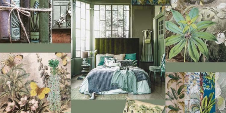
The theme “Nature is calling” is based on sustainability issues, and is inspired by flora and fauna, foliage, minerals, clay, and terra cotta shades for climate change solutions.
In the theme “Facets of Splendor” luxury and glamour prevail, in gem-like intense, rich colors and metallics. Art-Deco, nostalgia, history with a twist, and the curiosity cabinet are an inspiration for flamboyant maximalism.
1.SERENITY AND REFLECTION
The first theme “Serenity and Reflection” is a timeless styling theme, mainly in neutral colours. But this time a second colour card is added, with chalky pastel colours. After the pandemic we value our home even more, it is our refugee, our safe place, where we want to surround ourselves with warm tactile fabrics, with friendly curvy furniture, made of conscious-made, sustainable materials, where textures play an important role. Our home must double also as a workspace. Round shapes, arches and curves soften the space. Natural materials prevail such as linen, wool, bamboo, horn, and wood. We see oxidized surfaces, gradients, and blurred effects such as marbling, spots, and stains, reminiscent of landscapes and natural phenomena. Everything is balanced, we see Scandinavian but also Japanese influences, where quality and function, besides natural materials and respect for nature are the main properties. Textiles play an important role to console and soothe. Especially carpets take on unusual shapes and effects. Sometimes we see fine lines in black or anthracite, sometimes they display faces.
2.EXPERIMENTAL VISION
The second theme is called “Experimental Vision” and shows fresh clear pastel colours for a modern, innovative contemporary direction. Colour seems to shift in beautiful gradients on man-made products such as resin, Perspex, plastic, and glass. Often iridescent aspects play a role and show a modern approach. Translucent aspects and transparency are important. The decoration shows mainly geometrical and whimsical patterns. Also colour blocking is a beloved way of applying colour. Sometimes a brighter or darker colour is applied for more excitement. And we see organic shapes. But there is also space for a more romantic and delicate approach, for instance in flower prints, especially water colour flowers. They will be used for textiles, such as pillows, bedding, throws, curtains etc, but also for carpets, murals, and wallcoverings. We see waves and curvy lines. Sometimes products such as recycled crystal lamp components are combined with new parts for contemporary lighting. Biscuit porcelain is used for wind lights, and traditional blue porcelain motives are applied in combination with facets or in a-symmetrical, surprising way. Remarkable are the innovative carpets, celebrating free, unexpected shapes and the combination of materials and textures.
3.CULTURAL DIVERSITY
This styling direction is called “Cultural Diversity” and is inspired by the different cultures of the world, with their authentic one-of artisanal products. Now, especially Moroccan products are in the centre of interest. Besides the interpretation in neutral colours, we see now also more coloured products from North Africa. Hand-made products are very much in demand, for textiles, such as carpets, baskets, braided bowls, and kilims, but also metal products and tiles from different regions. Tadelakt is now also applied in Western houses. Indigo blue remains important. Authentic techniques are valued such as shibori, ikat and tie-and-dye, also from the Far East. Traditional motives from China and Japan are applied on textiles and wallcoverings, with images of for instance koi and cranes. Many products show texture, thick embroideries, and fringes. Masks and faces are beloved subjects. Wood, objects made of recycled wood, bamboo, and rattan remain popular. We even see painted sticks as decoration. Also, tribal patterns, from Aztek, Navajo or African origin are in demand. Walls have often a hand-made finish with a chalky clay effect.
4. OVER THE RAINBOW
This style direction “Over the Rainbow” is about a modern style direction, where bright colors are dominating. They are often combined with black or white, to bring them to the fore front. Color blocking is an important feature. These colors can be applied as a contrast, as a bright color, for instance as accents and for accessories. But they are used in a multi-color manner as well, as a rainbow, for a cheerful, optimistic approach. We still see influences of Modern Art, of Op-Art, Memphis, and Bauhaus, but they will be less important than the previous years, because also here the shapes become less angular and sharp. Here too, we will see more rounded, bean and curvy shapes. Overlapping shapes with special gradient effects are applied for textiles and carpets in unusual, free shapes. Carpets June lay on the floor but also will be used as hangings on the wall to give the interior a friendlier look. There are also playful examples of colorful pieces of furniture. One can play around with these pieces, sit, work and sleep on them and change their compositions dependent of the situation. Interesting are the nice renderings of Interiors, with Augmented Reality examples. Small versatile, foldable furniture such as stools, and small tables add a whimsical effect to the interior. Acoustical solutions will gain importance, as our homes will change to become home offices.
5. NATURE IS CALLING
This theme “Nature is Calling” is a continuation of climate-change and sustainability issues, one of the biggest challenges for the future. We want to surround us by nature, by plants and green foliage, flora, and fauna, but also by nature’s resources such as wood, clay, stone etc. Designers experiment with alternative materials such as algae, fungi, pineapple, corn, bark, milk etc. etc. and have turned them into applicable products such as vegan leather and textiles. Green in different shades remains therefor important, but we also see how Terra Cotta shades become more and more important. They also combine well with dusty pink. Exotic and tropical plants and trees
such as palms, but also all kinds of exotic animals remain popular, such as tigers, jaguars, monkeys, exotic birds such as cockatoos and parrots, pelicans, parakeets, but also elephants, zebra’s, snakes etc. Posters, murals and wallcoverings and textiles are inspired by the illustrations and engravings from Natural History books. Also, creatures of the sea are featured, such as fish, shells, and corals. Sometimes this style is combined with recycled industrial products, or materials that have been exposed to the elements and show cracks and fissures, corrosion etc. Copper, brass, and bronze oxidize. Pottery takes on the patina of age.
6. FACETS OF SPLENDOUR
In this direction “Facets of Splendor” the emphasis is on glamour and luxury. It is a nostalgic direction, where heritage and history are the sources of inspiration, but sometimes these influences are applied with a humorous twist. Metallics, especially gold, play an important role. We see that return in Art Deco influences and Mid-century furniture. Animals are often depicted as people or serve in lighting. Also, classical portraits with a twist of for instance Sultans and super realistic art from the Dutch and Flemish masters is used for products such as trays and plates, textiles, and wallpaper. Also, the curiosity cabinet with foreign objects from nature remains a source of inspiration. Besides metallics, precious stone is often applied, such as black and colored marble, malachite, and amethyst. There is also inlaid precious stone and mosaics. Colored “silver glass” makes a luxurious comeback, just as facetted and engraved crystal, and iridescent examples that have a more modern effect. Led’s and devices to recharge our mobile gadgets are incorporated in versatile furniture. The colors are dramatic and show contrasts in the matte and shiny materials or exhibit smooth opposed to rough texture effects. Velvet is one of the favorites in this style direction. Remarkable are classical fragments from the Greek and Roman times, used as decoration. They fit well also in the curiosity cabinet.


